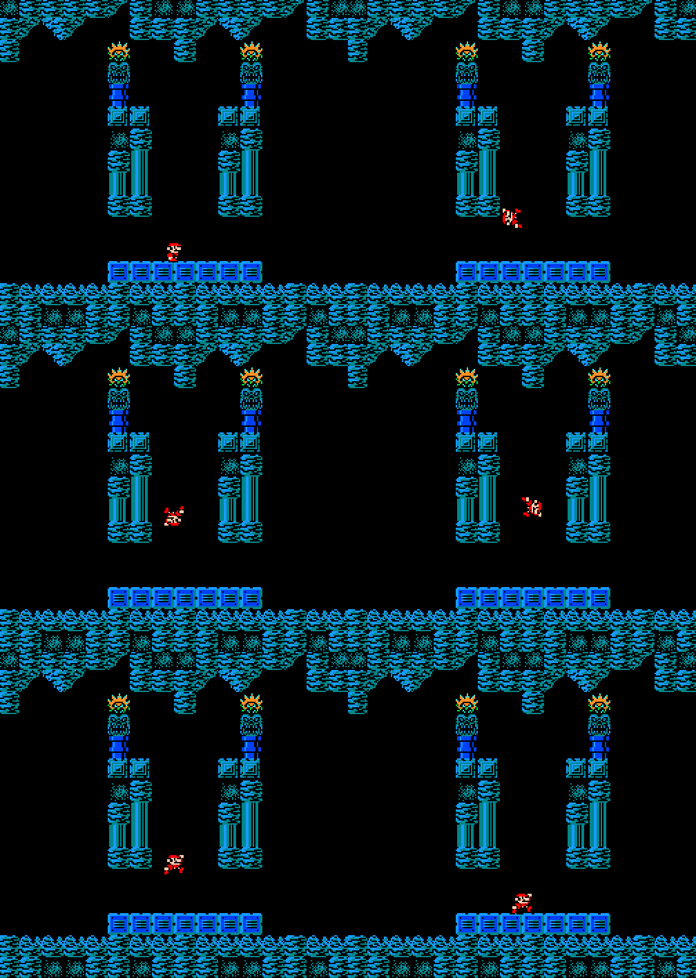
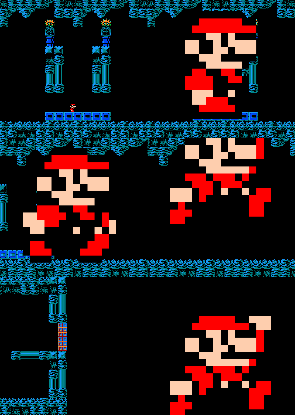
I decided to start writing in-depth posts for the devlog instead of doing tweets because I can add explanations to things. Also, the last devlog was about what I had done before, but from now on, I’ll be writing about what I’m doing now.
Clean up and Panels
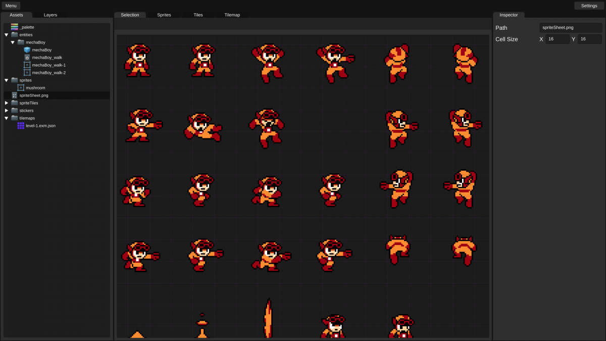
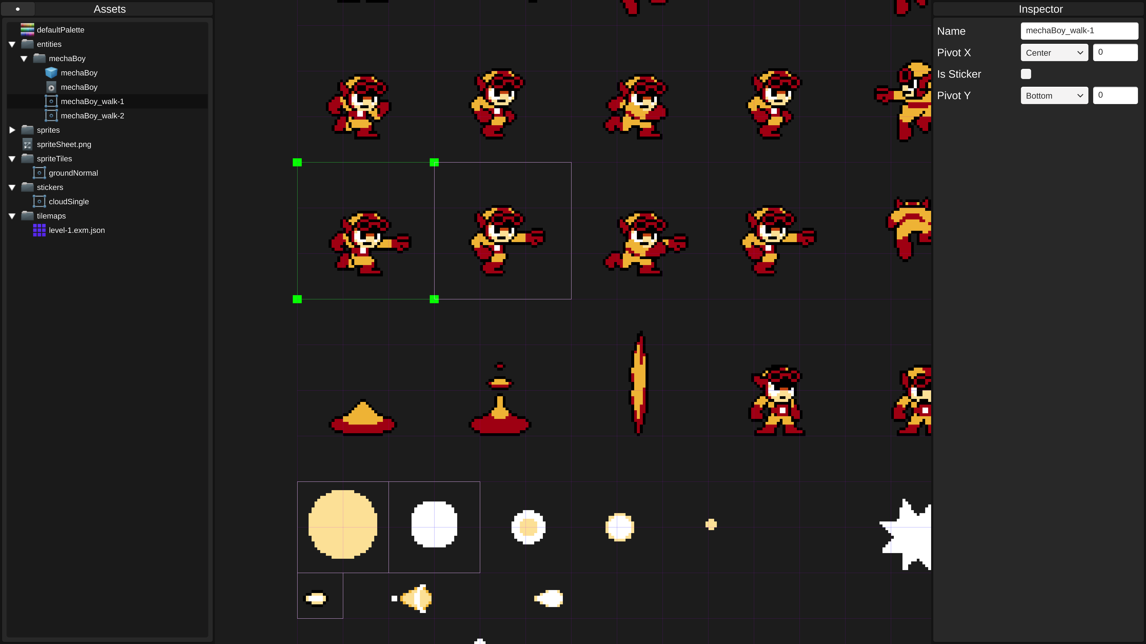
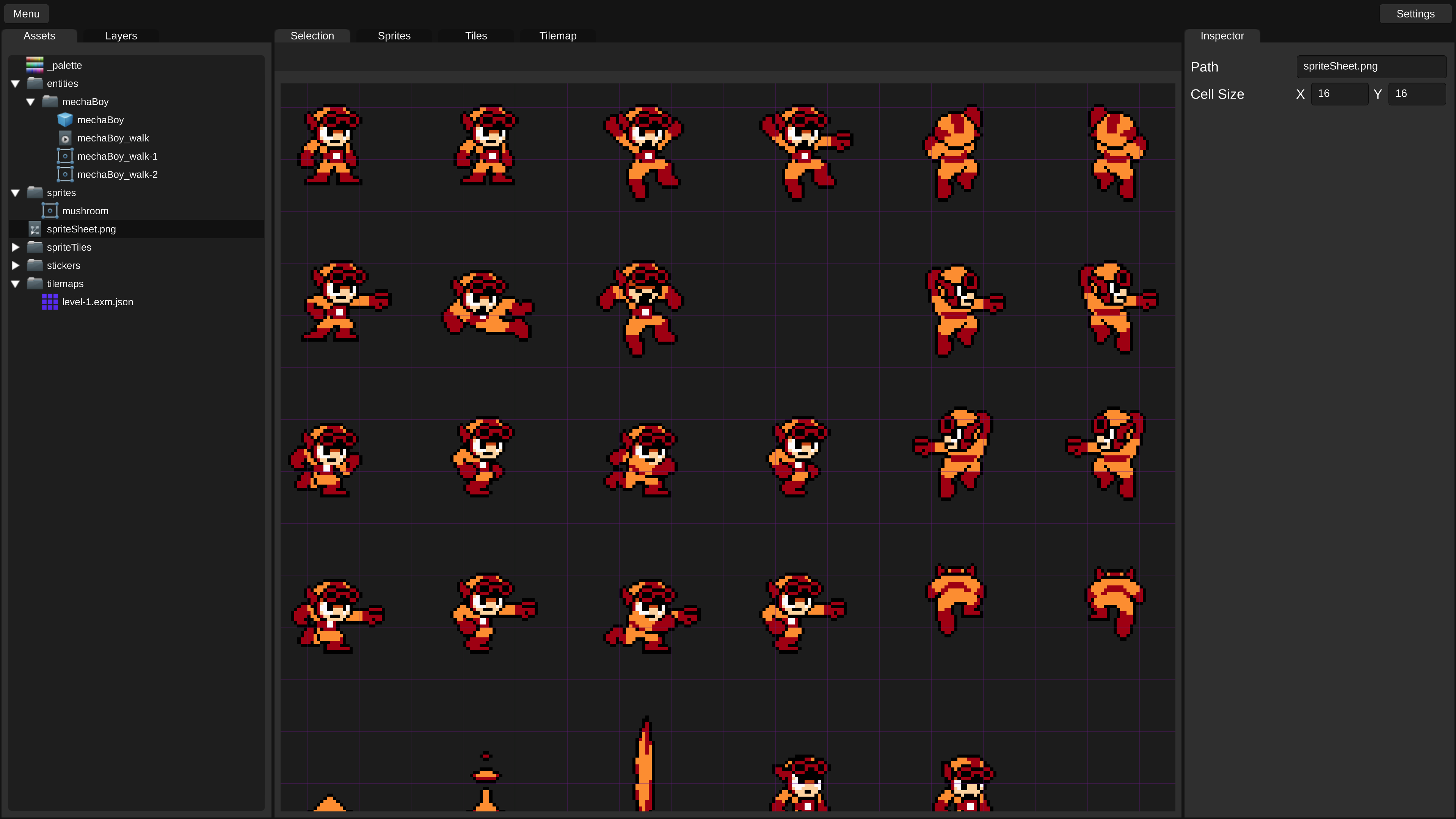
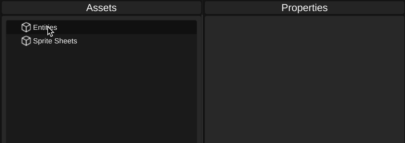
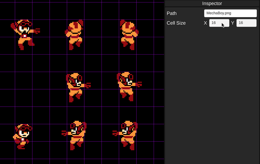
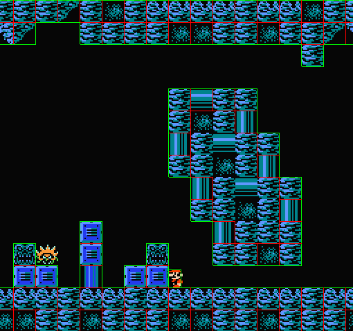
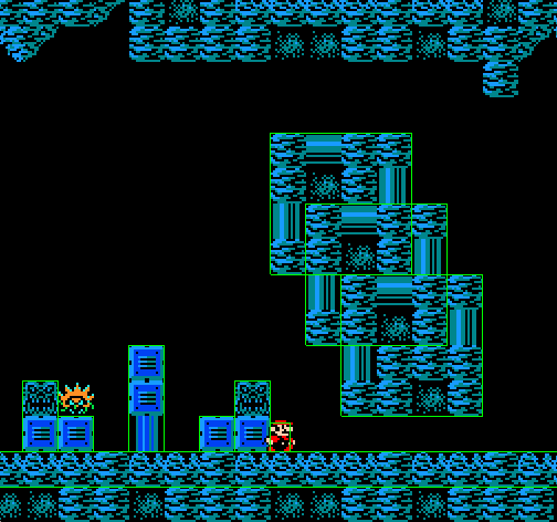
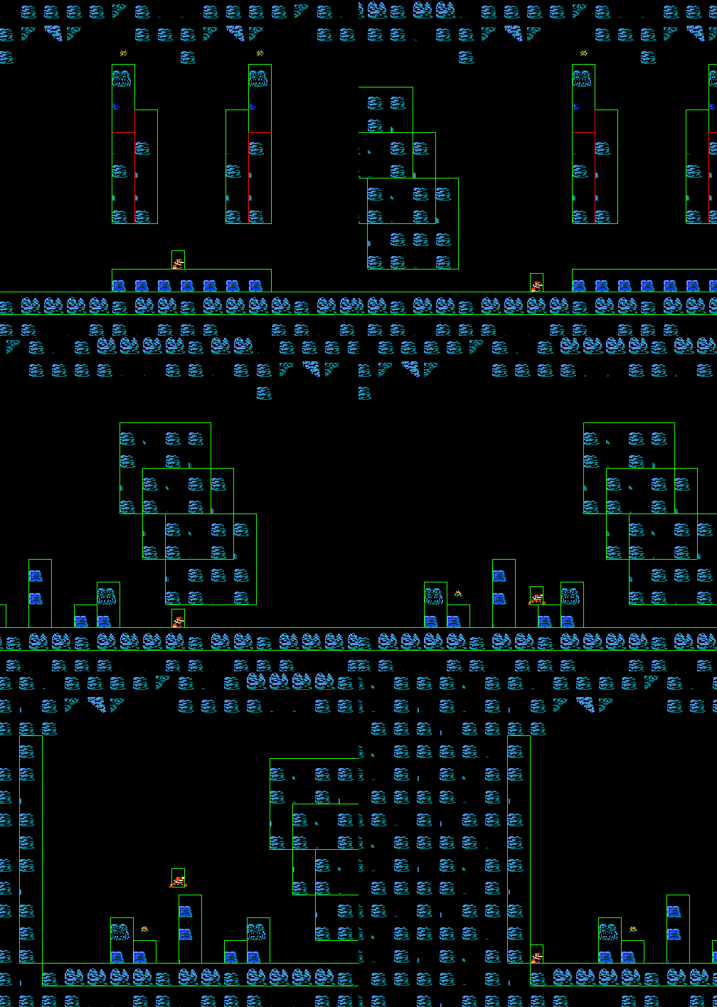
When I first started working on the Exploding Editor, it was just a personal tool, and I wanted it to get it working fast, so the code was not the best it could be. After I decided to release this to the public, I decided to go back and clean things up to save myself time and headaches in the future. While doing that, I also decided to make a major design change to the editor. Compare the two images below:
Here’s how the editor used to look.
Here’s how it looks now. The biggest change is the panels, but there is also space for a toolbar at the top, and it’s now possible to add a toolbar to any panel.
If you’re interested in the programming details, each panel is now in its own dependency injection subcontainer. I follow the facade pattern, so each panel is a facade and other classes have no access to the panel’s internals.
You may also notice in the current image that the textfields are a darker color. I wrote a simple styling system that I can apply to elements. That way, if I decide to change something, I only have to do it in one place. If you do things the regular way in Unity and use prefabs, getting everything to match style can be a real pain, so this is a nice simple solution.
public interface TextInputFieldStyle {
    Color backgroundColor {get;}
    Color textColor {get;}
    Color selectionColor {get;}
}

public static void applyStyle(this TMP_InputField target, TextInputFieldStyle style) {
    target.selectionColor = style.selectionColor;
    target.textComponent.color = style.textColor;
    target.targetGraphic.color = style.backgroundColor;
}

textField.applyStyle(style);
Here’s the gist of how it works.
Color Picker
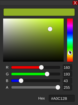
People will need to change colors of things in the editor, so I needed to have some kind of color picker tool. There are several solutions on the asset store, but there’s no way to try them out or see their code without buying them.
Instead I found a free one and then built my own while using it as a reference when I ran into trouble. It’s not completely done, but here’s how it looks.
Another reason I didn’t want to use any of the asset store solutions is that none of them use TextMesh Pro, the superior text solution in Unity. Exploding Editor supports retina displays, so it will be especially noticable if any text is low resolution.
The color picker doesn’t generate textures for the color box or the hue slider. They are implemented with shaders so they’re fast and use little memory.
Reactive Programming Example
The color picker UI is a great example of the benefits of reactive programming. I think in general not enough people use it, so I thought I’d show how using it can save you a lot of time and make your code lean and clean. The following code is in the ColorSliderView class which is used for each of the RGBA sliders shown in the animation.
public IObservable<ColorSliderView> valueChanged => slider
  .OnValueChangedAsObservable()
  .Select(x => (byte)x)
  .Merge(valueInputField.onValueChangedAsObservable()
    .Where(_ => valueInputField.isFocused)
    .Select(x => x.safelyParsedByte()))
  .Do(x => _value = x)
  .Select(_ => this);
Take a look at this code. It’s generating an IObservable to let observers know when something changes. It automatically combines changes from both the slider and the textfield, and it stores that value before sending the event. It also limits the event for the textfield to make sure it only sends it when the textfield has focus. This is to prevent a stack overflow.
sliders
  .Select(x => x.valueChanged)
  .CombineLatest()
  .Subscribe(_ =>
    picker.color = new Color32(sliders[0].value, sliders[1].value, sliders[2].value, sliders[3].value));
And here’s where the IObservables are subscribed to. Whenever any of the sliders change their value, the function in Subscribe is invoked, and the color picker’s color is updated with the new values.
What’s Next?
There’s a little bit of work left to finish the color picker, and then I have to finish transitioning the rest of the editor to the panel system. I mainly just have the sprites panel and the panels related to tilemapping remaining.

